
About this Graphic
This is a hand-illustrated graphic recording that summarize highlights from each of the presentations, created after the Maternal Health Equity Workshop: From Story to Data to Action, May 18, 2023, which was convened by the Association of American Medical Colleges. Graphic recordings were created by Drawing Change. The effect on the page is dynamic, with large flowing swoops at the top and illustrations of people and statistics throughout.
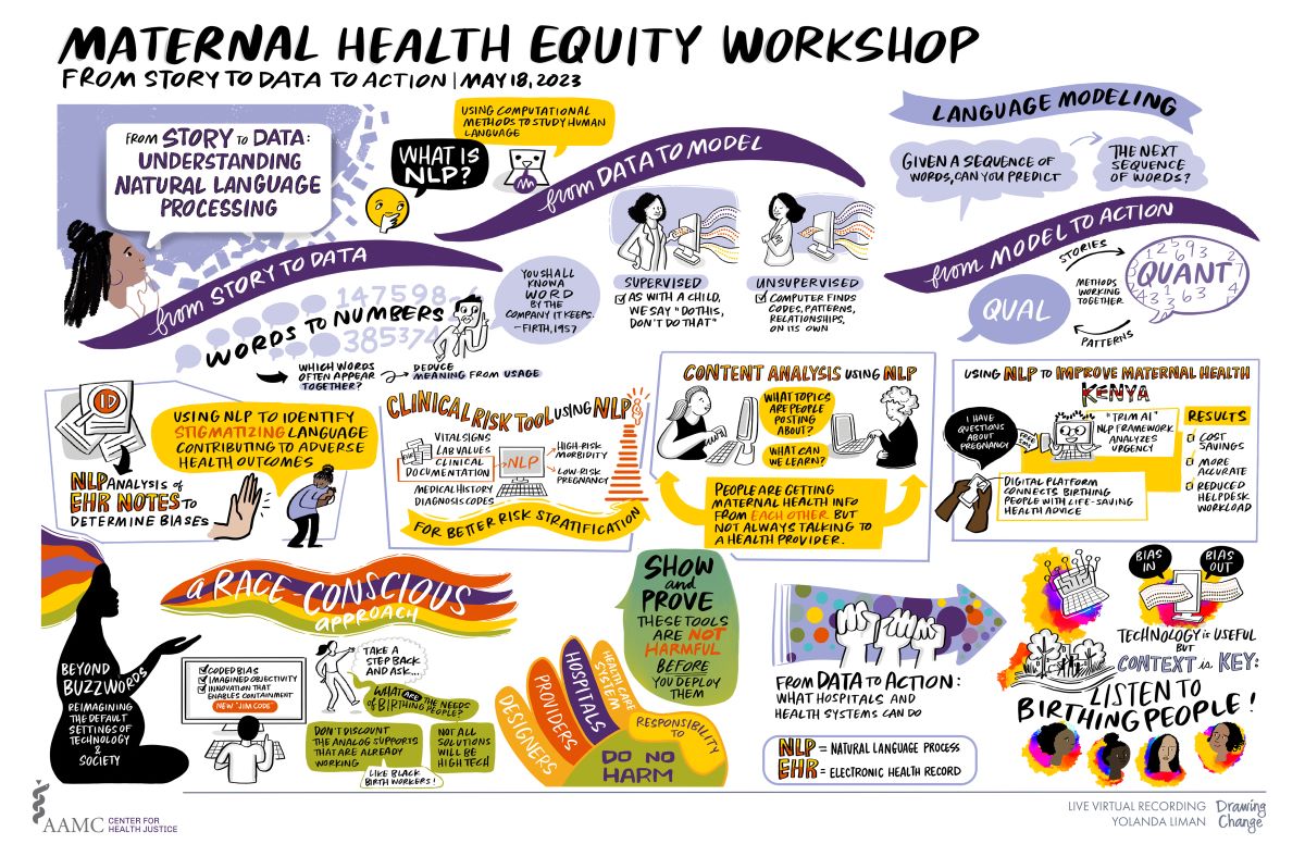
From Story to Data: Understanding Natural Language Processing
An illustration shows a Black woman reading the title out loud in a speech bubble, and behind her stylistically the background texture looks like randomized dots of data. A small yellow emoji asks, What is NLP? The answer: Using computational methods to study human language. There are three main swoops and sections.
From Story to Data
How things change from words to numbers. A small male cartoon figure says “You shall know a word by the company it keeps,” a quote attributed to Firth (1957). Text blocks read, Which words often appear together? Deduce meaning from usage.
From Data to Model
A Black woman feeding dots representing information into a computer. The caption says “supervised,” with two points: Like a child, we say ‘do this, don’t do that’; and, next to this, a drawing of the same woman turning away from the same computer which is processing the same information without her touching it. The caption says “unsupervised,” and the main points are that the computer finds codes, patterns, relationships, on its own; there is text but no labels.
From Model to Action
This section addresses language modeling. Given a sequence of words you can predict the next sequence of words. There are two speech bubbles labeled “Qual” and “Quan” with connecting arrows labeled “stories” and “patterns,” and in the overlap it says, “methods working together.”
Research Presentations
In the middle section of the graphic there are four boxes, one for each of the presentations.
NLP Analysis of EHR Notes to Determine Biases
- ID common themes and signals that contribute to unsafe conditions, with a drawing of a magnifying glass on top of papers/
- A Black woman holding her baby in a scared way turning from a giant symbolic hand that gives an oppressive feeling; a yellow speech bubble says, “we know stigmatizing stereotypes contribute to adverse maternal outcomes.”
Clinical Risk Tool Using NLP
- A flow chart with three columns. On the left are vital signs, lab values, medical history, diagnostic codes, and clinical documentation. The term “documentation” is highlighted and arrows lead into the second column with a computer, indicating that these data are fed into a computer.
- The computer says NLP on it. Underneath, “for better risk stratification” is written on a curving banner.
- The outputs from the computer are two choices: high risk morbidity and low risk pregnancy. There is a small figure of a series of bars stacked like a pyramid, which visualizes the concept of risk stratification.
Content Analysis Using NLP
An illustration of two stylized figures with long, curly hair looking for information online, with neutral facial expressions. The text between the figures says, “What topics are people posting about? What can we learn?”
Findings:
There is a brightly colored pie chart for this data with shading to make it look 3D. The components are:
- Maternal health, 45%
- Baby, 29%
- People/relationships, 10%
- Products: 6%
Topics by Trimester and Postpartum:
This is a brightly colored arrow facing right, and the sections are as follows from left to right:
- Miscarriage (left, in red)
- No one topic (next section, in orange)
- Labor (in yellow)
- Baby sleep routine (right, in green)
The final sentence of this box is in bold text on a bright background and reads, People are getting maternal health information from each other but not always talking to a health provider.
Using NLP to Improve Maternal Health in Kenya
The word “Kenya” is illustrated stylistically in the national colors, and a pair of Black hands are texting on a cell phone “I have questions about pregnancy,” this is a free SMS. This is a digital platform that connects birthing people with life-saving health advice. The text goes to a computer with cute eyes/face that reads it, and the computer is labelled “TRIM AI,” which analyzes the urgency with the NLP framework. The results are in a list with checkboxes: 90%, cost savings; 17%, more accurate; 12%, reduction in help desk workload.
A Race Conscious Approach
There is a multicolored ribbon that gracefully swoops across the page with the words “a Race-Conscious Approach,” which are the largest words on the page. On the left-hand side in solid black silhouette is a pregnant person, seated cross-legged, with their hand outstretched reaching into the banner and whose large, natural hair is also drawn in the muted pastel colors of the ribbon. There are small spot illustrations throughout the piece and text is separated by background shading and different lettering sizes. The pregnant person has text written in the silhouette: “Beyond Buzzwords: Reimagining the default settings of technology and society.”
Race and AI
We see the back of a person with short dark hair typing at a computer. On the screen are these phrases:
- Coded bias
- imagined objectivity
- Innovation that enables containment
- New JIM code, highlighted in a contrasting (red) color
Queries
A small figure drawn in outline with a long ponytail has text behind them that reads, Step back and ask, and then the person asks, “What are the needs of birthing people?” Three speech bubbles connect and say:
- Don’t discount the analog supports that are already working
- Like Black birth workers!
- Not all solutions will be high tech
Risks of AI
There is a stylized hand with palm upwards and the fingers are each a different color (that match the Race-Conscious banner): the fingers read: Health care system, hospitals, providers, designers = responsibility to do no harm. Next to the hand is a huge green bubble with the main takeaway: Show and prove that these tools are not harmful before you deploy them.
From Data to Action
Small illustration with three fists outlined, held up in a solidarity/action gesture, on top of an arrow that has different colored dots representing varied data. The title on top of the arrow reads, "From Data to Action,” and the title reads, “What public health hospitals and health systems can do.”
Illustration of a computer with data going in and out, with a caption that says “bias in, bias out.” It is connected with an arrow to a computer and microchip illustration, which blends into a city scene with a park and people walking, and also blends into four multiracial faces looking at each other and smiling. The text says, “Technology is useful but context is key — listen to birthing people!” These four faces and text conclude the poster with the exclamation.